Bar Chart race using ‘gganimate’ for world’s most efficient wheat yield producing countries

Bar Chart race using ‘gganimate’ for world’s most efficient wheat yield producing countries

April 21, 2019

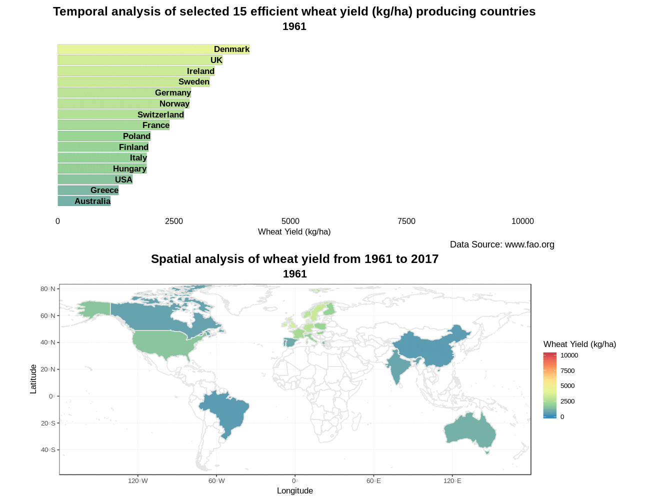
Easy spatio-temporal visualization of 15 selected efficient wheat yield producing countries using #gganimate in R. The below-mentioned bar chart race shows that Ireland leads the world in efficient wheat yields. Related to this, an article written by John Spink @teagasc says “Yields over a 10-year period are nearly 10% higher than the UK and well above those of New Zealand, which boasts the world wheat yield record.”

The respective code is given and explained on my Github account.

follow us and share it on:

you may also like:

Exploring the Power of Orfeo Toolbox

Exploring the Power of Orfeo Toolbox

This week, our Eagle students have been soaring deeper into the world of spatial science with the Orfeo Toolbox (OTB) — a powerful open-source library for remote sensing image processing. Originally developed by the French Space Agency (CNES), OTB offers a rich suite...

Share This